The Evolution of Call-to-Action Language
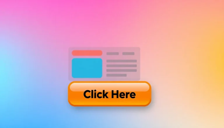
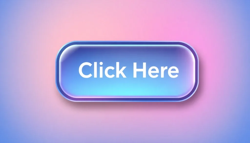
In the born digital world, the language we use as call-to-action (CTA) plays a pivotal role in how users interact with content. This exploration into the evolution of CTA language unveils changes in user preferences and the critical need for clarity in communication. For a deeper insight, you may consider Click Here to further explore related themes in user interaction.
Understanding User Interaction Preferences
User preferences are primarily shaped by technological advancements and changing user behaviors. In the early days of the internet, the language used was often simple and direct. Phrases like “click here” emerged out of necessity; they were easy to understand and fit the predominantly mouse-driven interaction model of users. However, as user interactions have significantly evolved, so too have their expectations for digital communication.
Historical Context of “Click Here”
Initially, “click here” served a purpose. Back when web design was more rudimentary, this phrase was a straightforward instruction for users, particularly those less familiar with digital navigation. However, as web designs became more sophisticated and user experience became a focus, the phrase began to show its limitations in conveying the intended action.
Shifting Trends in Digital Communication
With shifting digital trends, there is a growing emphasis on accessibility, SEO, and user engagement. Marketers and content creators are moving away from generic phrases like “click here” towards more purposeful and descriptive language that provides clear context for the link’s action or destination. The evolution from mere instructions to more engaging CTAs signifies a broader recognition of the importance of language in enhancing user interactions.
Why You Should Rethink Using “Click Here”
The Issue with Vague Link Text
The phrase “click here” fails to communicate the value or purpose of the link. Users often appreciate clarity and concise instructions that bolster their ability to make informed decisions. Vague language can frustrate users and make navigation cumbersome, leading to increased bounce rates and decreased user engagement.
Accessibility Concerns for Screen Readers
Accessibility is paramount in digital communication. Users relying on screen readers face significant challenges when confronted with uninformative link text. Screen readers often extract link text for navigation without providing any context, making the navigation experience disjointed for visually impaired users. This underscores the importance of crafting meaningful and descriptive link text to enhance inclusivity across all user types.
SEO Implications of Poor Link Choices
From an SEO perspective, using “click here” can dilute the potential ranking power of a given link. Search engines utilize anchor text to comprehend the context of links and their significance to the linked content. Thus, vague or uninformative link text can negatively impact search engine rankings, limiting content visibility and reach. Phrasing links in a way that signals value can significantly drive SEO performance.
Alternatives to “Click Here”
Creating Meaningful Link Text
To improve user engagement, it is crucial to develop link text that delivers clear meaning. Instead of instructing users simply to “click here,” consider describing what users can expect upon clicking the link. For instance, “View our portfolio” or “Download the eBook” not only clarifies the action but also sets user expectations, enhancing their experience.
Using Action-Driven Language
Incorporating action-driven language in CTAs can incite a sense of urgency and encourage user engagement. Such phrases empower users by providing clear calls to action, prompting them to take the next step. Statements like “Schedule your consultation” or “Get started now” infuse urgency and encourage users to act immediately, potentially enhancing conversion rates.
Examples of Effective CTAs
Let’s explore some practical examples of effective CTAs:
- Sign Up for Our Newsletter: This invites users to gain regular insights while making it clear what value the action provides.
- Download Your Free Trial: This emphasizes both the action and the benefit, appealing to users’ interests in free resources.
- Join Our Community: This fosters a sense of belonging and prompts users to connect with others, thereby enticing engagement.
Best Practices for Call-to-Action Links
How to Optimize Link Text for Engagement
Optimizing link text for maximum engagement involves keeping it concise, relevant, and actionable. It’s essential to use language that resonates with your target audience. Performance metrics such as click-through rates can help determine the effectiveness of specific wording, allowing for data-driven adjustments for better outcomes.
Testing Different Variations for Better Results
A/B testing various link phrases can yield valuable insights into user preferences. By experimenting with different CTAs, companies can learn which messages resonate most effectively, leading to optimization based on actual user behaviors rather than assumptions. This iterative approach allows marketers to hone their messaging continually.
Incorporating Design Elements to Enhance Clickability
The aesthetic presentation of CTAs can also shape user engagement. Design elements like contrasting colors, bold fonts, and creative graphics can draw attention to links. An inviting button with the text “Start Your Free Trial” stands out visually and invites interaction. Incorporating these design strategies enhances both the link’s visibility and likely engagement rates.
Conclusion: The Future of User Interaction Language
Emerging Trends in Digital Communication
The digital communication landscape is ever-evolving. Innovations in technology and heightened user expectations will continue to shape how we craft CTAs. As artificial intelligence and machine learning play increasing roles in user experience design, there remain opportunities to leverage data insights for more personalized and effective CTAs.
Final Thoughts on User-Centric Design
User-centric design prioritizes user needs and behaviors, shifting away from generic instructions toward custom-tailored messages. The approach extending beyond just the text into the holistic design of user interfaces enables brands to meet users where they are, providing value in every interaction.
Encouraging Feedback and Continuous Improvement
Encouraging user feedback on CTAs would yield additional insights into user preferences and expectations, which can be addressed in future iterations of content and design. Continuous improvement in approaches to language and interaction, informed directly by user input, establishes a feedback loop that enriches user relationships and fosters brand loyalty.